30 Image Composition Styles for Taking Good Pictures
Since I decided to start learning photography a few months ago, I’ve been looking for a good catalog of composition ideas. Once you figure out the mechanics of how a DSLR works, getting good at the composition of your photos seems to be the 80/20 of rapidly improving at photography.
I looked around and heard that the best book on the subject was “The Photographer’s Eye” by Michael Freeman. It’s explicitly about composition and walks through all of the elements of good composition for beginner photographers. It’s a fantastic introduction, and I highly recommend reading it.
After finishing the book, I went back and pulled out all of the compositional styles he mentioned explicitly or implicitly that I liked and thought were useful, and found a good example on Unsplash for each one. I wanted to practice recognizing them so that I could better pick them out in the wild, and incorporate them into my own photos.
It was originally for my own notes, but I realized that they might be useful for other beginner photographers too. So enjoy! And follow me on Instagram while I try to figure this all out.
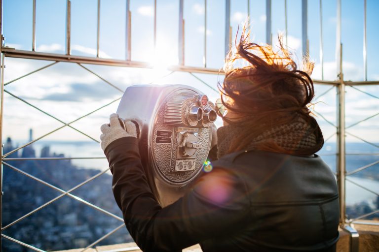
1. Edge-Cut Sun
Having an edge cut through the sun looks nice, or having the sun rising over a line or diagonal within the photo.
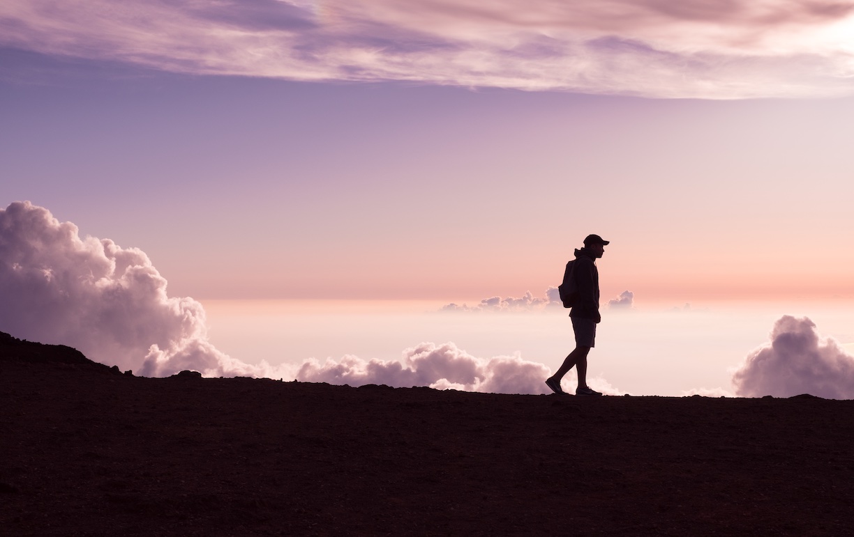
2. Dark Figure and Background
A figure silhouetted against an interesting background looks quite nice. This also incorporates the “big sky” effect.
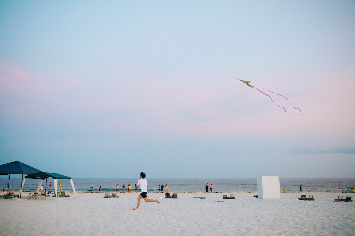
3. Big Sky
For incorporating sky, either having the majority be sky or a smaller piece looks nice. 2/3 and 1/3, in either direction, can work. In this case, the sky dominates the frame.
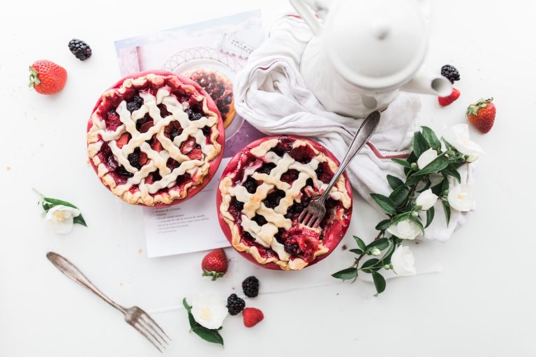
4. Separate Shapes
Separate, different sized shapes placed somewhat unevenly but with a balanced weight.

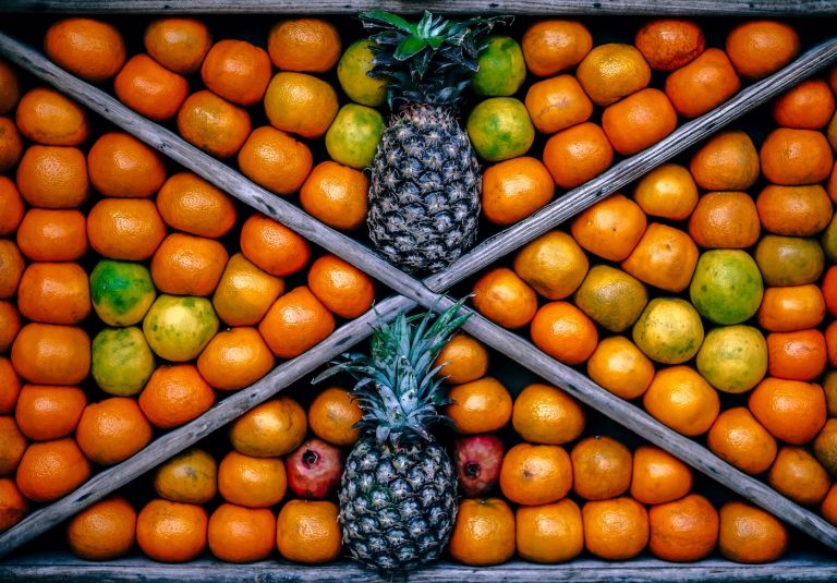
5. Frame Fit
Filling the whole frame, right to the edges, with the subject(s).
6. Off-Center
The 1/3 and 2/3 lines are safe bets for putting objects off center, as are the points halfway between the center of the frame and the corners.

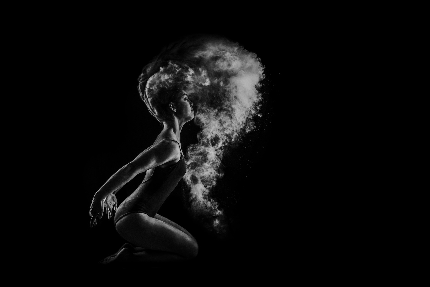
7. Chiaroscuro (light and shadow contrast)
Creating a strong contrast of light and dark, using lights and shadows.
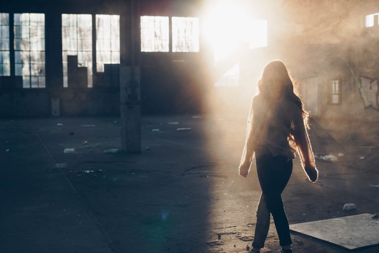
8. Walking into the Frame
It tends to look better to have a subject moving, or appear to be moving, into the frame instead of out of it.
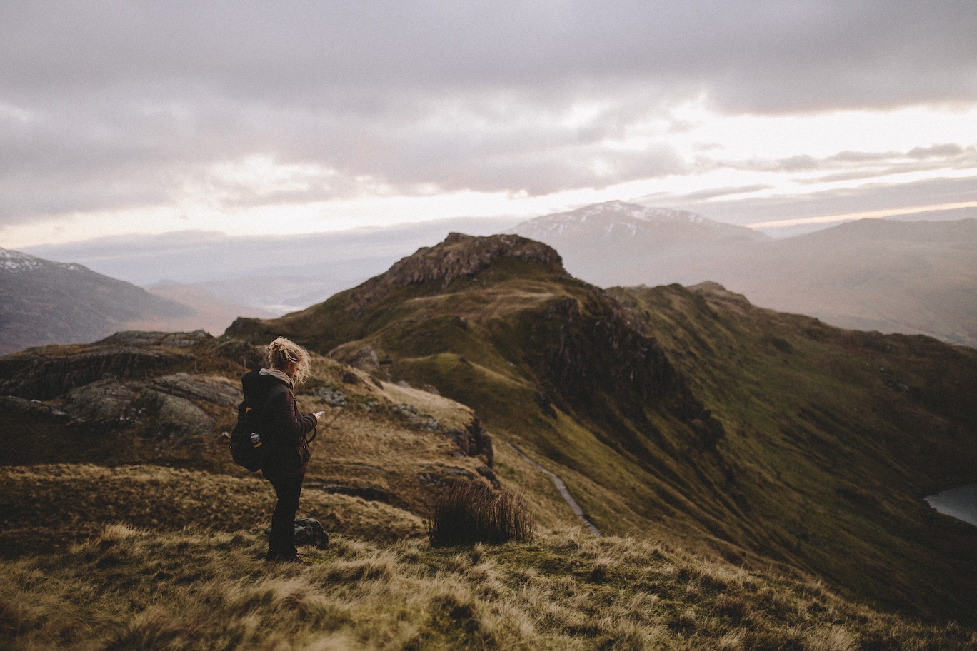
9. Figure in a Landscape
Having a figure with a landscape can give you a sense of how large and imposing the scene is.

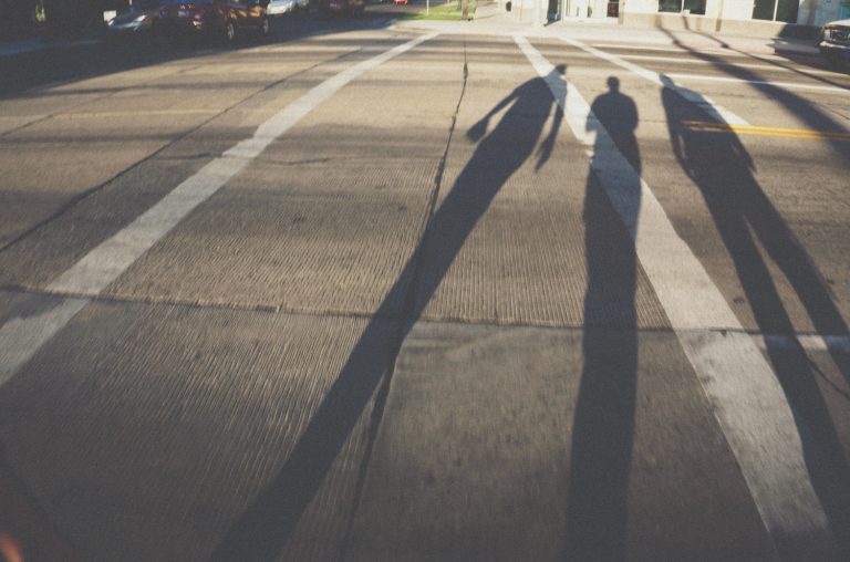
10. Shadowscape
Shadows look cool basically.
11. Reflection
Here with the mountains in the water, this will usually require water or another reflective surface.
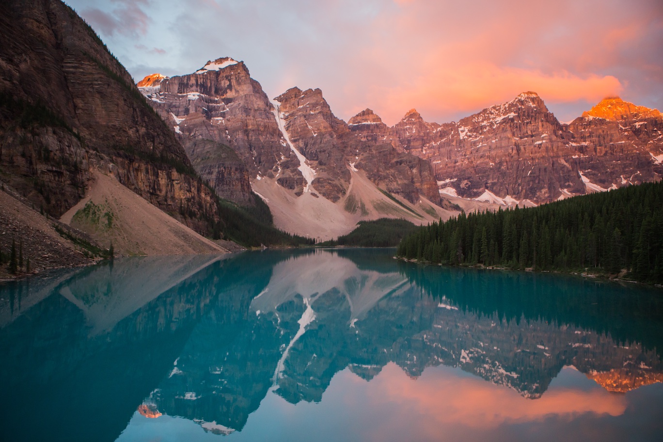
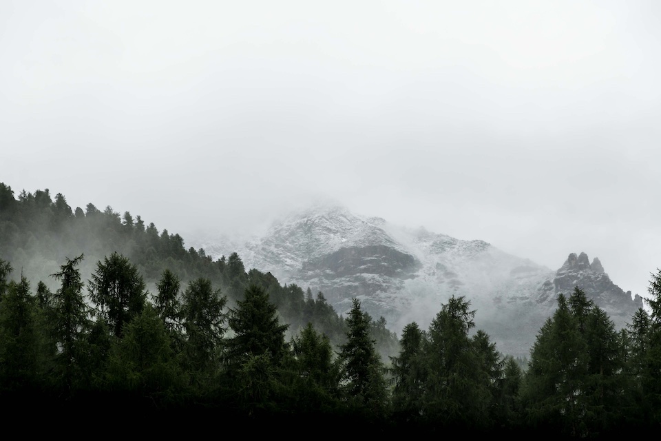
12. Stacked Planes
Stacking planes at different distances within the photo, as with these parts of the mountain, creates more depth and an interesting composition.
13. Many Subjects
Having many subjects that overlap the frame and extend beyond its edges.

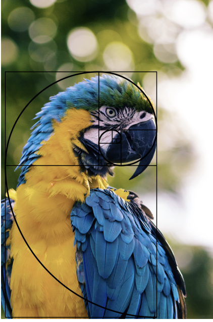
14. Fibonacci Spirals
You can place objects within the frame based on the points of the Fibonacci spiral, or you can find elements displaying the spiral themselves.
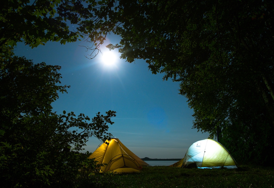
15. Framing
When you can, it’s a nice effect to frame one element of the shot within another, such as a building through a gap in a bridge, or in this case, the tents through the trees.
16. Strong Triangles
A triangle cutting through the frame brings attention to the apex.

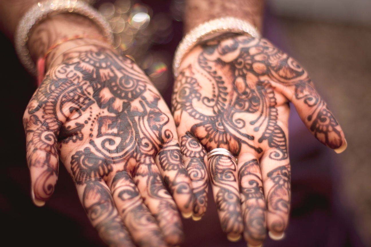
17. Inverted Triangles
An upside down triangle also brings strong focus to the apex, in this case, the henna art.
18. Diagonals Cutting through the Frame
A strong diagonal dividing the frame, especially effective when the focus is different on different sides of the diagonal.
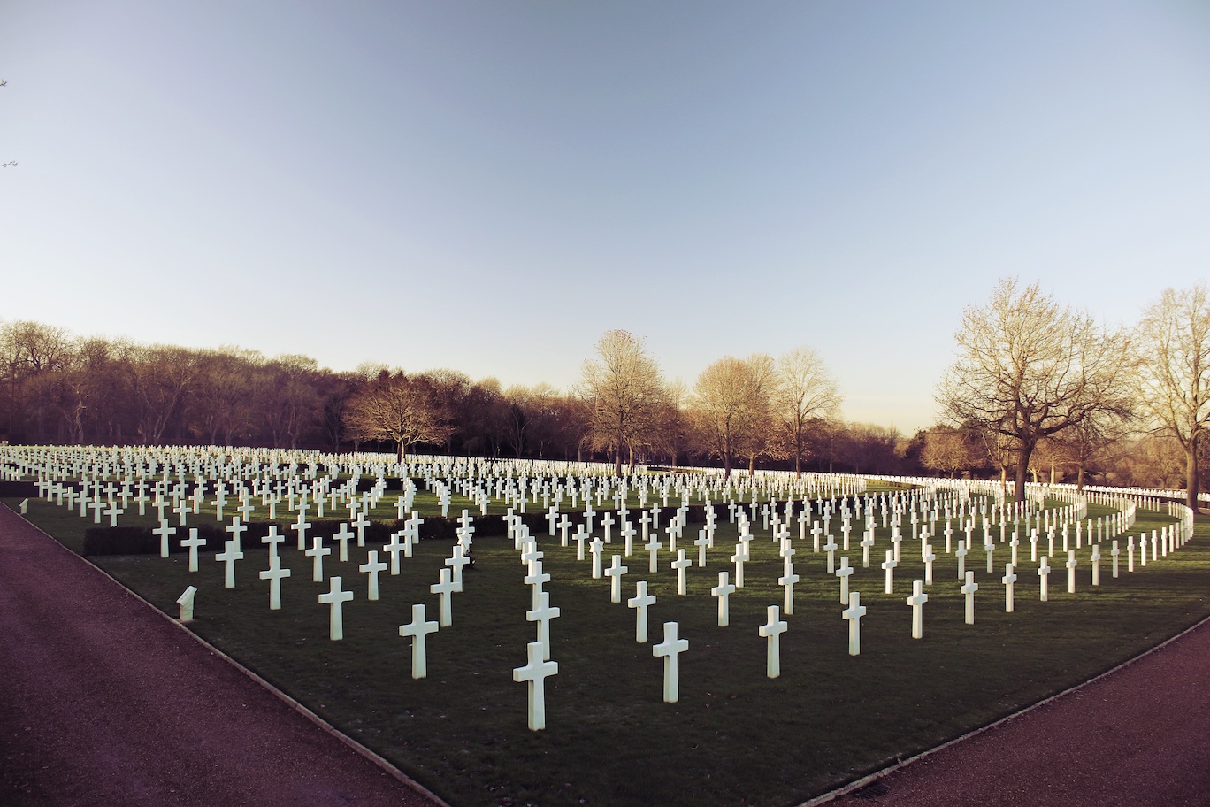
19. Concentric Curves
Having a number of curves forming concentric circles like the gravestones in this photo.
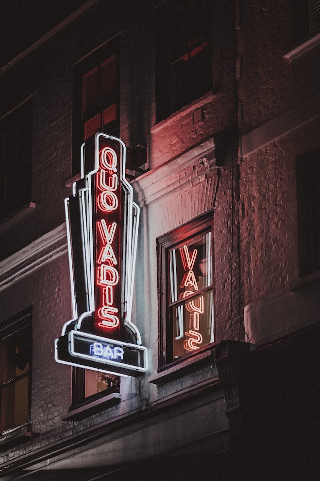
20. Edge Alignment
Lining up the edges of the subject with the edges of the frame, as with this sign, can create a nice symmetry.
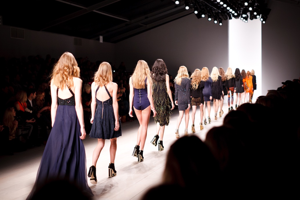
21. Vertical Subjects in Horizontal Frame
When you have a number of vertical subjects, such as these models, it looks nice filling out a horizontal frame as opposed to being in a vertical one.
22. Motion
To catch motion, you can time the shot with a repetitive action such as throwing dirt from a shovel or wait for some action you can anticipate.
23. Pattern Interruption
When you have a consistent pattern, as with these hands up and lights, it looks nice to interrupt it as with the pillar.

24. Converging Diagonals
Similar to the inverted triangles, converging diagonals are a good way to bring focus to the apex.
25. Eye Lines
Eyes draw attention to certain parts of the frame. In this case, the male runner’s eyes cause us to focus more on the female runner, who is also closer to a stronger focal point of the frame.

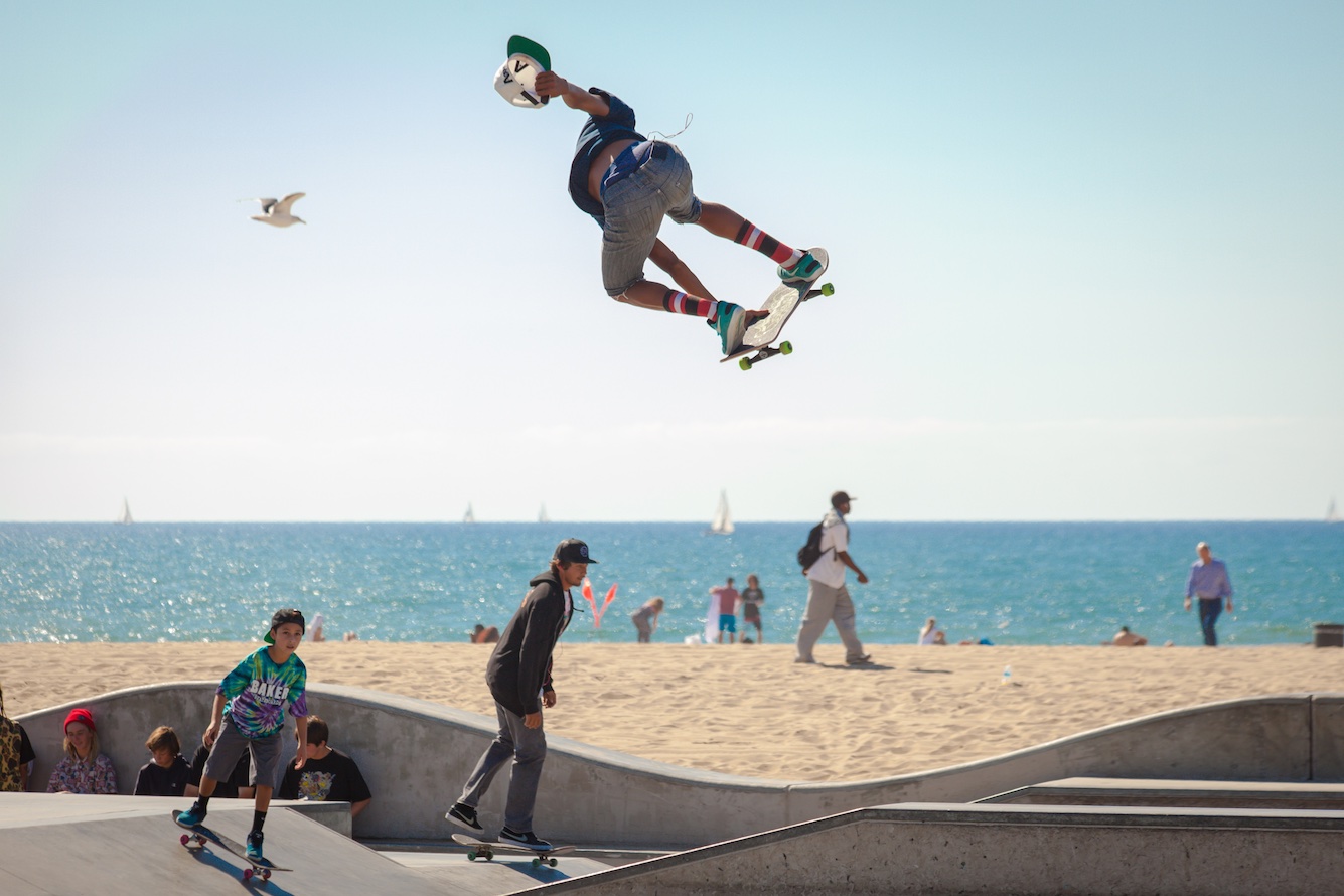
26. Vertical Continuation
If there are multiple vertical subjects in a frame, such as a tree in the distance and someone standing, lining them up can create a nice continuation effect. In this case, the skater in the air above the one on the ground.
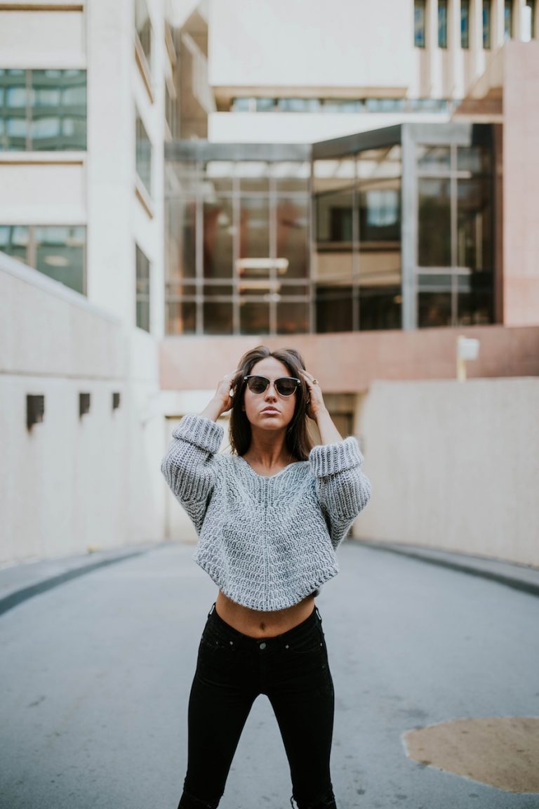
27. Low in the Frame
For vertical photos with a single subject, it looks good when placed low in the frame.
28. Contrasting Elements
An easy way to make a photo more interesting is to introduce some form of stark contrast: liquid/solid, hard/soft, delicate/brash. In this case, the solid shell in the water.

29. Dynamic Balance
When you have multiple subjects in the frame, they should balance each other out, even if they’re not symmetrical. The windmill on the right balances out the one on the left even though the left one is closer to the center, since the right one is larger in the frame.
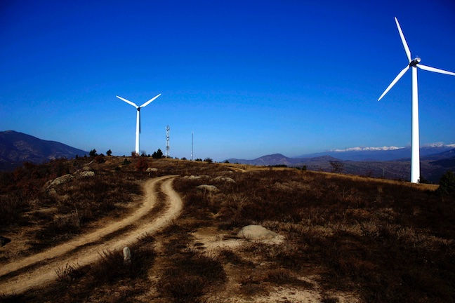
30. Diminishing Perspective
From focus or distance, you can create the effect of the perspective diminishing throughout the photo.
